

Picture this: Your organization does valuable work that positively impacts your community, but you’re finding it difficult to demonstrate that impact to potential supporters. Sound familiar? This struggle is all too common, but thankfully there is a solution — with data visualization, your organization can demonstrate its mission and impact in a concise yet powerful way. Read on to learn what data visualization is, how it can help your organization tell its story, and best practices for how to implement it.
What Is Data Visualization?
Data visualization (also known as dataviz) is the mechanism used to break down and translate overwhelming or confusing data sets into an easily digestible visual medium. Doing so can simplify complicated findings and make them easier and quicker for your readers to understand. Dataviz also makes it easier to readily identify trends or spot outliers in the data. But most importantly for nonprofits, it can be used to highlight the “why” behind your organization and its mission.
Telling Stories With Data
For data to have an actionable impact, it must be presented in a compelling way. Think of the stories your data can tell. (There are probably many.) By using data visualization, as illustrated in the examples below, your organization can highlight topics such as:
- The problems you’re working to solve
- The demand for your services
- Fundraising progress
- Program accomplishments over time
Additionally, visuals are inherently more shareable than written text, so board members, employees, volunteers, and donors will be more likely to share them with their social networks, expanding your reach. And remember, these visuals are not taking anything away from the quality or availability of your data — you can and should still provide a text narrative alongside any graphics you choose to create.
Examples of Data Visualization
What do data visualizations look like? Different types of dataviz can include breakouts, bar charts, line charts, tables, maps, donut graphs, and pie charts. When used properly, each allows users to better interpret data. (However, some are more advantageous than others; it all depends on the data you’re working with.)
The below report cards were created using the March of Dimes 2020 PeriStats data, which provides maternal and infant health information across the United States. These report cards, which PRI creates annually for March of Dimes, help to illustrate the most common visualization types.
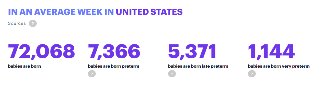
Breakouts highlight key data. These are particularly useful when you want to draw focus to a problem or accomplishment. The following graphic highlights the average number of births in the U.S. as well as the average number of preterm, late preterm, and very preterm births.
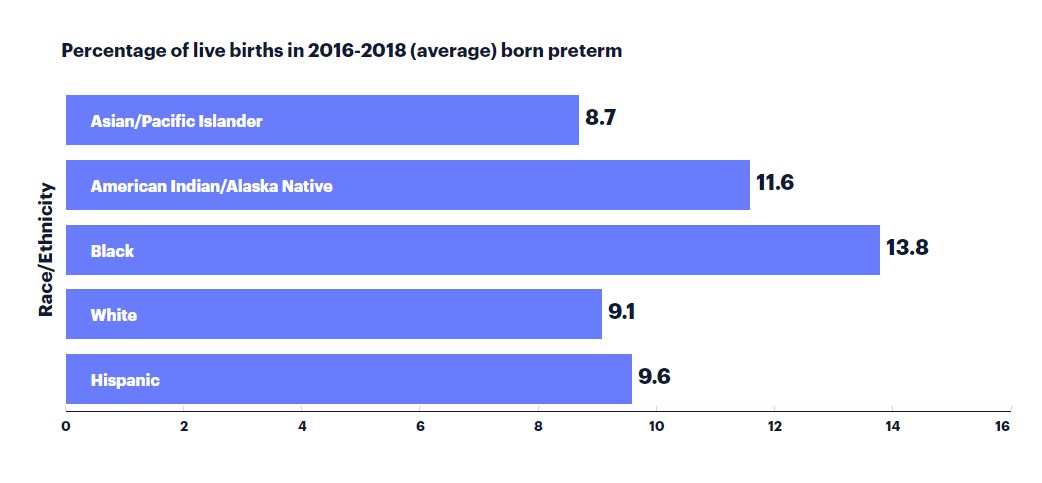
Bar charts compare data from several different categories and can be displayed horizontally or vertically. For instance, the below graphic displays the preterm birth rate by race and ethnicity in the U.S.
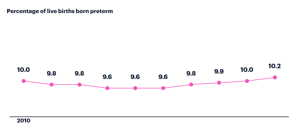
Alternatively, line charts compare the same data over time. The following graphic displays the percentage of live preterm births from over a 10-year period in the U.S.
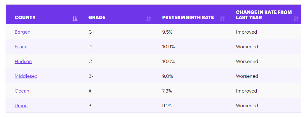
Tables divide and organize data into clear and digestible categories. The below table displays the preterm birth rates by county for New Jersey, as well as each county’s grade and whether it has improved or worsened since the previous year.
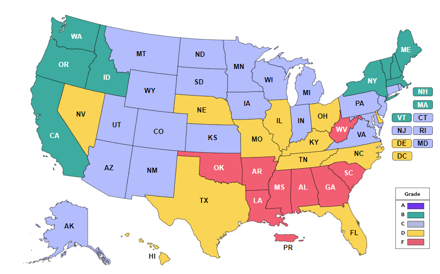
Maps show data in relation to a place. In the below graphic, the map illustrates each individual state’s grade in relation to the rest of the U.S. These grades are calculated based on preterm birth rates, and include other information such as infant death, states’ efforts on Medicaid expansion and extension, health insurance status, inadequate prenatal care, and other factors that can make a difference in health outcomes.
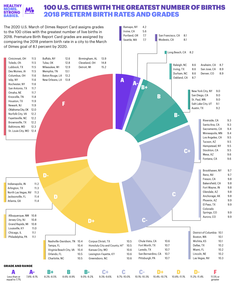
Pie charts and donut graphs show data as pieces of a whole. The following graphic displays the 100 U.S. cities with the greatest number of births by their respective birth rate grades.
Finally, any and all of these visualization methods can be combined into a single infographic to give a more broad overview of the data.
Tips for Building Beautiful Data
You have your data sets, you’re convinced you need to create eye-catching visuals to accompany them, and you know which type of graphic you should use — but you’re still not quite sure how to proceed.
Start with your purpose. What do you most want readers to learn from your data? What action do you want them to take? Let your answers serve as your North Star, guiding you forward and dictating what’s most important. That data should go at the top-most level, no matter what dataviz method you use to illustrate it. Be sure to include any related call to action in your narrative that explains the graphic. From there, move on to the data that reinforces your call to action or best tells your story.
Be sure to break the data up into sections. Creating some space between each graphic allows readers to process and digest the information more easily. Additionally, add titles and use font choices, bold type, and capitalization to further break up and emphasize your data.
When creating the graphics, use color appropriately. This is an opportunity to tie in brand colors if you like, as well as further highlight important information. Here are a few best practices when using color in your data visualizations:
- Use colors to define and differentiate the categories of data.
- Opt for darker or more opaque colors for more important data and lighter or less opaque colors for less important ones. If using a gradient of a single color to represent the data, define the most important using the darkest and boldest color. This method can also allow you to note outliers or instances where data is not available.
- Include a legend to identify what each color means so individual colors need not be labeled.
- When using color, be consistent across your graphics. If the color red means something in one graphic, it should mean the same thing in all other graphics.
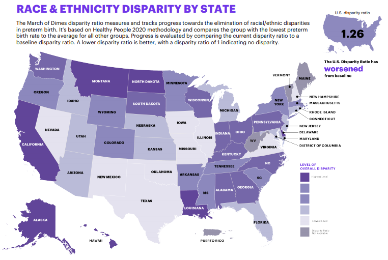
In the report card below, the states that are the darkest have the highest level of race and ethnicity disparities in preterm birth rates. As you can see, the states without this disparity data are filled in with a color that is more greyscale than the rest of the purple gradients. It doesn’t disrupt the visual effect of the map as a whole, but it does clearly indicate that those states are different in some way. From there, readers can look to the provided legend to determine what each color means, and why some may be different.
Make Data Interactive
Empower your readers and donors to explore your data as they wish. Obviously, if the data visuals are printed in a hard-copy annual report, readers cannot interact with it; however, if your graphics are going to be living on a website, give users the opportunity to explore and drill down further if you have the data available. For example, if providing a map of the U.S., allow users to click on individual states to explore their statistics. If providing tables, allow readers to click to sort the table based upon the factor they are most interested in. Finally, provide dropdowns or allow readers to hover over points of interest so they can see additional information.
Change the World
Now you’re ready to tell your organization’s story with data. When done right, data visualization can emphasize the importance and urgency of your cause, let your donors know their funds are being put to good use, attract new donors or sponsors, celebrate program successes, and so much more. If you can leverage your data for good and ensure it’s beautiful and easily understood, you can change the world.