 Anyone who calls themselves a designer (or strives to be one) should know the basics of typography. Even if you’re not a designer, you may be asked to proof a letter, review a brochure, or make a design decision. Take your work to the next level by using “smart” quotes—that is, quotation marks and apostrophes that are curly and point in the correct direction.
Why all the confusion? In the old days, typewriters had only one key for both the right and left double quotation marks, and one for the apostrophe. The apostrophe also served as both the right and left single quotation mark. Then, of course, there are feet and inches. But let’s back up a bit.
Here are the four sets of punctuation we’re talking about:
1. The Apostrophe
The apostrophe is used for:
- Possessives: Elena’s blog post, for goodness’ sake, Fred and Sylvia’s stocks.
- Omitted letters and figures in a contraction: don’t, isn’t, ’90
- Plurals of a single letter: Mind your p’s and q’s. (Though this is optional for readability, technically you could also write“ps and qs.”)
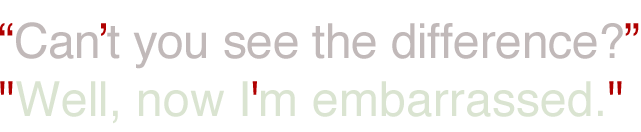
2. Double Quotation Marks
Double-left and double-right quotation marks are used for:
- Direct quotations: “I have no intention of staying,” he replied. She said she was horrified at their “slovenly manners.”
- Composition titles: The chapter on the mini skirt, “Looking Back at the 1960s,” was particularly interesting.
- Nicknames: John “Tiny” Smith
- Irony: The “debate” turned into a media circus.
- Unfamiliar terms: The main ingredient in her secret recipe is the “chanterelle” mushroom.
3. Single Quotation Marks

Though you will see them used incorrectly in place of double quotes, single-left and single-right quotation marks are primarily used for a quote within a quote. He said, “She told me ‘I love you.’”
4. Prime and Double-Prime Marks

Prime marks (sometimes called “tick” marks) are primarily used as symbols to designate feet (prime) and inches (double prime). For example: The sign was 8' 11″ high. (Note that in most uses you would spell them out: Lester is exactly 3 feet 5 inches tall.)
OK, back to how this all started. Typewriters were used for drafts and final manuscripts were professionally typeset prior to printing. The layperson cared little about whether their points were pointing in the right direction, or if they were curly. Look at your keyboard now and you’ll see we still only have one key for both. It’s with the advent of desktop publishing and word processing software that this topic even came into play.
In case it’s not clear, here’s a quick introduction to the typography of curls:
Usually, your computer will do the heavy lifting for you; but sometimes, especially when text is copied and pasted, those awful prime marks can sneak in. Always check your punctuation marks, and pay extra close attention to headlines and titles when they are on display.
And, speaking of headlines or any use of large type, sometimes you use the right format, but your chosen font’s apostrophe is not very exciting. Go right ahead and swap just the apostrophe for a different font that does satisfy. Compare:
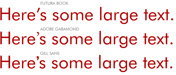
The main font is Futura Book. The first line is all set in Futura, but I’m not crazy about the apostrophe. In the second and third lines, I’ve replaced only the apostrophe with different fonts. I feel that while Gill Sans is curvy enough to complement the text, I like the lightness of the Garamond apostrophe better because it doesn’t dominate the text. (Designer Tip: Squint at the type and you’ll see what I mean.)
The next time you’re preparing a presentation, reviewing an advertisement, making a cover page, or finishing a report, perform a quick “search and replace” to make sure you’ve been “smart” about using smart quotes and apostrophes.
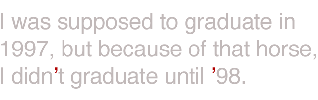
One last tip. When you use ’98 for the year 1998, make sure you use an apostrophe, and not a single-left quotation mark. To trick your computer into using the correct one, type in the number followed by an apostrophe (98’), then cut and paste that apostrophe so it’s before the number (’98). It’s the same as any other contraction—like aren’t or don’t. You use the single-right apostrophe in place of the omitted letters/numbers.
*Disclaimer: I’m speaking specifically about printed material or graphics. If you’re handling coded type on a webpage, then it’s better to leave things alone. Right and left quotation marks sometimes render strangely from browser to browser, and will show up either as a random character, or not at all.