
Buttons are one of the most important interaction elements in any website or app. Buttons are for taking action and the big stuff you need users to take usually comes down to a specific action or two. Create an account, make a donation, and of course, check out.
And yet buttons are rarely given the attention they deserve. So let’s learn how to make buttons as effective and powerful as possible.
What Even Is a Button, Anyway?
Let it be known: a button is not a link. A link takes you somewhere — a button triggers or facilitates an action. A button involves doing something.
So we understand function, but what about form? This is an easy one: make a button look like a button. In the 90s, it was fun to move your mouse around and see what was clickable. Today that behavior is measured in bounce rates. Unless you’re truly experimenting, stick with what people know. 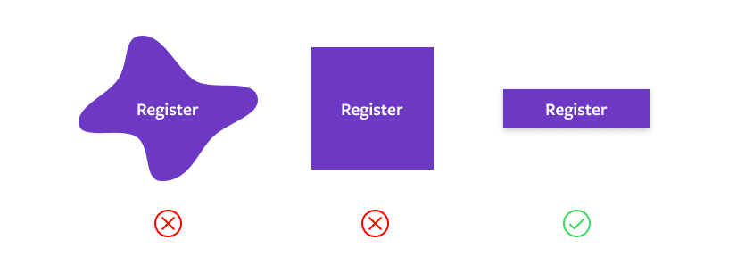
Button Shape
Recognizable buttons come in three basic styles: square, rounded corner, and pill. Your choice depends on the overall look and feel of your site. Square feels formal, technical, or minimal; pill is friendly or casual; and rounded-corner buttons can be anywhere in between. Personally, I think a subtle round edge is the most versatile shape. 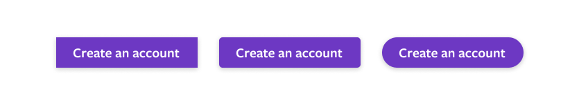
When Is Flat Too Flat?
Flat design was all the rage for a while, but the past few years dimension has returned. One reason is that we’ve learned outline buttons and ghost buttons, the darlings of flat design, can be difficult to identify as buttons. They still have their place, but carefully consider flat outline buttons before using them for primary call to action (CTA).
Button Hierarchy
Now, let’s leave behind the conceptual realm and dig into how buttons work in context. As mentioned, buttons are extremely important interaction elements. Your primary button isn’t called a “call to action” for nothing. However, it’s easy to overdo it, which is why you should have a few different types of buttons.
- Primary Buttons: These should be reserved for the most important action on a screen, page, or section. It’s common to see more than one on long, scrolling pages with multiple sections, but reserve them for the most important content.
- Secondary and Tertiary Buttons: These are for content and desired action that is less important than primary (no one said it was rocket science). They’re often paired with a button of a higher priority.
You can use size as well to signal hierarchy as well! For designs with lots of buttons, it’s useful to have your three buttons in a couple of sizes.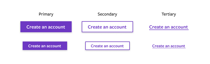
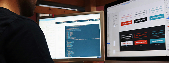
Button States
Something we all know from real-world interactions: a button isn’t really a proper button unless you can press it. Or click it, tap it, bop it… 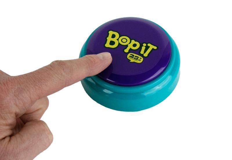
This isn’t just an 80s kid reference; this photograph encapsulates the design practice made infamous in 90s web design of borrowing design elements necessary in physical objects for use as non-pragmatic visual cues in graphical user interfaces to take advantage of familiarity in a context that was at the time unfamiliar! Also known as skeuomorphism. Image: Fat Brain Toys
Button states are great for passing on subtle cues to a user (interaction feedback) like if something is clickable or if their action did something. They’re also vital for accessibility, since someone navigating with an assistive tool other than a mouse needs the same feedback. And as seen above, they help communicate that a button is a button.
(Note that there are a lot of terms for various button states, but the state remains consistent.) 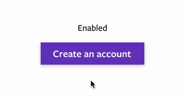
More Notes On Button States
- Focus is for keyboard or voice navigation. Browsers all include default focus states, but you should consider a custom focus state that compliments the design of your buttons.
- It’s common for “Clicked” and “Focus” to use the same design, as they typically don’t need to contrast with each other.
- Remember: there is no hover on mobile — or when navigating via a keyboard or voice tool. Don’t gate information behind a hover state without also designing an equal alternative for non-mouse cases.
- Disabled buttons do not have to comply with color contrast rules for accessibility, since they are inoperable elements. That said, best practice is to avoid disabled buttons entirely, when possible.
The humble button is crucial to creating effective and powerful user interactions. By paying attention to these details, we can harness the full potential of buttons and elevate the overall effectiveness of our digital platforms.
More From Our Team
Want to work together to create more impactful, clickable designs? Take a look at our other writings below and reach out to us today.


