This is part two of our examination of the humble button. If you haven’t already, be sure to check out our previous post about button basics. In it, we covered what makes a button — its shape, styling, hierarchy, and states. Now, let’s dive into how you can ensure your buttons are accessible and use inclusive design practices.
Size Matters
Button dimensions come down to two basic requirements: accessibility and visual design.
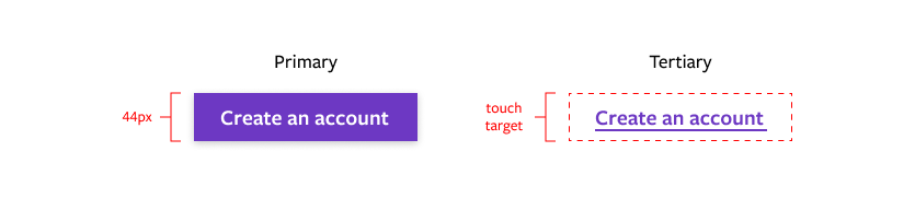
Touch Target
A touch target is the size of the clickable area of any given element, generally the minimum size for usability. Not everyone has an easy time hitting a teeny tiny element with their mouse, finger, or other pointing device.
WCAG 2.1 states that touch targets must be at least 24x24 pixels, and 44x44 for AAA compliance. While you’ve got some wiggle room there, it’s a good idea to keep your larger button touch target to 40px and above. For reference, Google’s Material Design specifies 44px, while Microsoft recommends at least 40px.
 Button Dimensions
Button width can be consistent regardless of the length of button text, or based on scalable interior padding.
For buttons with a single width, make sure that your longest button text doesn’t squeeze against the edges too closely. Make the universal width wider, or better yet, shorten the button text.
For buttons based on interior padding, there isn’t one true formula and it ultimately comes down to your specific visual design, but there are some general guidelines:
- Avoid horizontal padding that’s smaller than the vertical padding.
- Horizontal padding set at 2-3x vertical is a pleasing proportion.
- Set a minimum width to avoid huge variations between elements.
There are instances where a button stretches across several grid columns. This is usually seen on product detail pages, where the “add to cart” CTA is the width of the rest of the details block. This works because the position of the CTA on a product page is very familiar and expected. But in general, avoid very wide buttons.
Finally, buttons are coded by line height and padding, not total button height. So when you hand off designs to your developer or create annotated components, instead of saying “40px tall”, you would specify a line height of 24px and a vertical padding of 8px.
Then your developer will convert that 24px into 1.5rem and 8px into .5rem, so if a user increases their base font size, your buttons will remain to scale. If you want to figure out the rem values yourself, check out this handy px to rem calculator!
Icons & Labels
A button isn’t a button without some sort of label, and like everything else button-related, it’s important to get it right.
Icons
- Icons to the left (to the left): Icons are meant to give a visual hint to the following text, so they’re most useful on the left.
-
I need space: Give icons a space or two between the icon and the text. Normal horizontal padding rules apply to the icon and text as a whole.
Copy
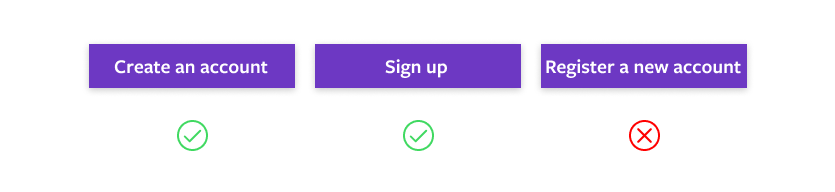
Getting your button text right is critical for button success. Again, there are a few simple guidelines for designing well-performing buttons:
- Use verbs for action. It’s a sad and confusing button that says “I’m Done” instead of “Submit Registration.” The purpose of the button should be as clear as possible.
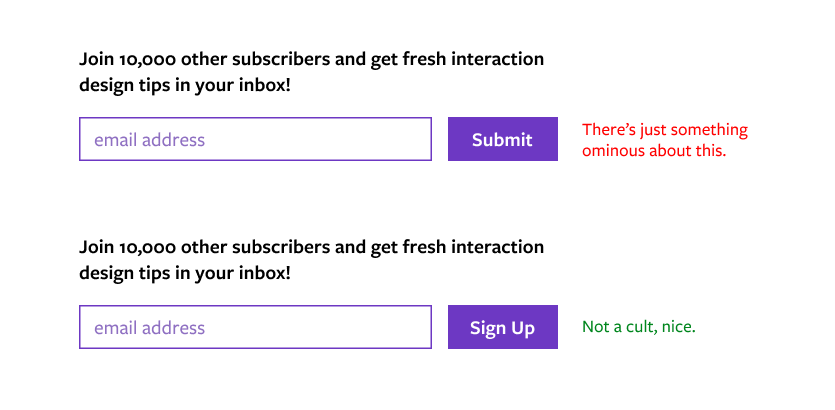
- Use words that are specific to the context. Instead of “Submit,” try “Publish.”
- Use consistent sentence structure. If one button says “Sign up” the next should be “Register.” Or pair “Sign up for updates” with “Register your account.”
- Choose your letter case thoughtfully.
- Sentence case and title case are generally safe choices, but avoid title case for longer labels.
- All-caps can be appropriate for formal, professional, or technical contexts and design, but it can often feel like shouting and isn’t the best choice for readability.
- All lowercase is rarely used, but can work for very casual or friendly designs.
Be A Good Digital Citizen
I’m going to wrap this up with some advice, or maybe it’s a plea — don’t use your new-found knowledge for evil, a.k.a. dark patterns. In the world of buttons, this might look like having a miniscule touch target, shaming language on opt out or cancellation buttons, or extraordinarily low contrast for actions you don’t want the user to take.
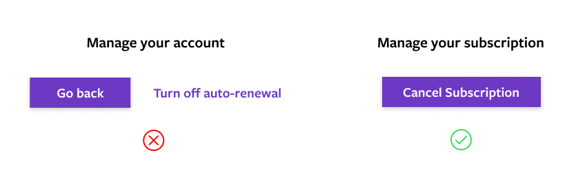 It’s almost like this interface is trying to trick the user…
By ensuring your buttons are accessible, inclusive, and kind to your users, you can ensure a click-worthy user experience.
More From Our Team
Want to work together to create more impactful, clickable designs? Take a look at our other writings below and reach out to us today.


