
The em dash vs the hyphen and what to do when WordPress automatically changes it, whether you like it or not.


“Most people do not listen with the intent to understand; they listen with the intent to reply.”
—Stephen R. Covey, The 7 Habits of Highly Effective People: Powerful Lessons in Personal Change
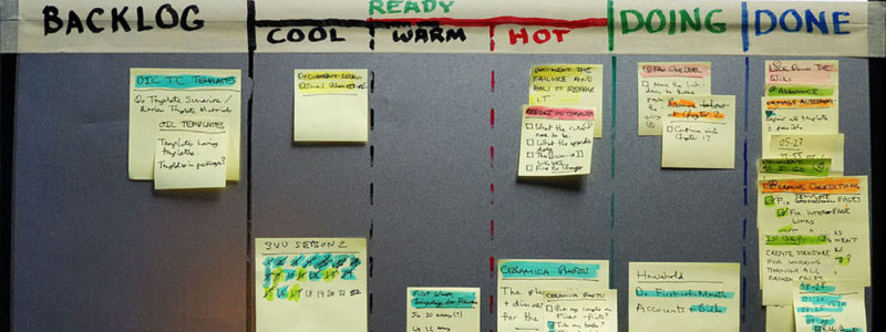
There are loads of articles praising productivity. They explain how to pack more into your workday, multi-multi-task, and squeeze every minute of every day until every last drop of work can be extracted.

 Every now and then designers and/or developers run into the problem of designing a website or application that includes non-web fonts because not all fonts are installed on all end-user computers or other devices. Therefore, one often settles for one of the 11 less-appealing core web-fonts, which include Andale Mono, Arial, Arial Black, Comic Sans MS, Courier New, Georgia, Impact, Times New Roman,Trebuchet MS, Verdana, and Webdings. These are the standard fonts used by all devices. It’s been the only way to ensure that all website visitors will see exactly what the designer intended. The only alternative is to render your type as graphics, which is impractical. What follows are some solutions for using the exact font your design requires, or at least a font reasonably close.